|
Jun 23, 2008
Hansen Goes Off the Deep End Again. Time for NASA or the Public to End his Reign
Put Oil Firm Chiefs on Trial, Says Leading Climate Change Scientist.
By Ed Pilkington, The Guardian
James Hansen, one of the world’s leading climate scientists, will today call for the chief executives of large fossil fuel companies to be put on trial for high crimes against humanity and nature, accusing them of actively spreading doubt about global warming in the same way that tobacco companies blurred the links between smoking and cancer. Hansen will use the symbolically charged 20th anniversary of his groundbreaking speech to the US Congress - in which he was among the first to sound the alarm over the reality of global warming - to argue that radical steps need to be taken immediately if the “perfect storm” of irreversible climate change is not to become inevitable.
Speaking before Congress again, he will accuse the chief executive officers of companies such as ExxonMobil and Peabody Energy of being fully aware of the disinformation about climate change they are spreading. In an interview with the Guardian he said: “When you are in that kind of position, as the CEO of one the primary players who have been putting out misinformation even via organisations that affect what gets into school textbooks, then I think that’s a crime.”
He is also considering personally targeting members of Congress who have a poor track record on climate change in the coming November elections. He will campaign to have several of them unseated. Hansen’s speech to Congress on June 23 1988 is seen as a seminal moment in bringing the threat of global warming to the public’s attention. At a time when most scientists were still hesitant to speak out, he said the evidence of the greenhouse gas effect was 99% certain, adding “it is time to stop waffling”. Read more if you have the stomach here.
Icecap Note: Read this excellent post by Anthony Watts entitled “If Global Warming was a Company Decision, How Would You Vote?” on Hansen and his latest ”cognitive dissonance” outburst. Instead of suing big oil, I think the American people ought to seriously consider going after Hansen and Gore who are as much responsible for the energy and food crises by turning a minor largely natural, cyclical change into an earth-threatening, man-made disaster by manipulating both science and data. Environmental groups and some politicians share the blame and if we can’t sue them, we can stop donating to their causes and/or kick the bums out of office. Maybe we can put Boxer’s picture on Unleaded, Gore on high test and Hansen on Deisel pumps to remind folks where the blame really lies. In this Washington Post story, Sen. James M. Inhofe (R-Okla.) said the bill’s failure was proof that Hansen’s message had not caught on. “Hansen, Gore, and the media have been trumpeting man-made climate doom since the 1980s. But Americans are not buying it,” Inhofe said. “It’s back to the drawing board for Hansen and company as the alleged ‘consensus’ over man-made climate fears continues to wane and more and more scientists declare their dissent.”
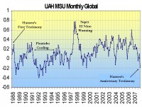
See how global temperatures have declined according to NASA satellites since Hansen’s first testimony in June of 1988.

See larger image here
Jun 19, 2008
Climate Realist Declaration Tops 1,100 Endorsers
By Tom Harris
Since its creation in March by the International Climate Science Coalition (ICSC), the Manhattan Declaration on Climate Change has attracted signatories from 40 countries. Although ignored by most media and governments, endorsement for the Declaration has rained in from hundreds of climate experts and other scientists, as well as professional engineers, economists, policy experts, medical doctors and average citizens. The complete declaration text, endorser lists and international media contacts for expert commentary, may be viewed here.
The Manhattan Declaration concludes, “Attempts by governments to legislate costly regulations on industry and individual citizens to encourage CO2 reduction will slow development while having no appreciable impact on the future trajectory of global climate change. Such policies will markedly diminish future prosperity and so reduce the ability of societies to adapt to inevitable climate change, thereby increasing, not decreasing human suffering.”
“Just as the Manhattan Project was key to finally ending the Second World War, the Manhattan Declaration on Climate Change may one day be regarded as a critical catalyst that helped end today’s climate hysteria,” said ICSC Science Advisory Board member, Professor Bob Carter of James Cook University, Townsville, Queensland. “Protecting the natural world is crucially important and so environmental policy must be based on our best understanding of science and technology coupled with a realistic appreciation of the relevant economics and policy options. This is not happening in the climate debate.”
The ICSC is an association of scientists, economists and energy and policy experts working to promote better public understanding of climate change. ICSC provides an analysis of climate science and policy issues which, being independent of lobby groups and vested political interests, is an alternative to advice from the IPCC. ICSC thereby fosters rational, evidence-based, open discussion about all climate, and climate-related, issues. For more information about the Manhattan Declaration or the realists’ view of climate change, go here.
“The hundreds of well qualified endorsers to the Manhattan Declaration should end, once and for all, the highly flawed notion that only a tiny number of so-called ‘skeptics’ dispute the science underlying the Kyoto Protocol”, said Carleton University Earth Sciences Professor and ICSC Chairman, Dr. Tim Patterson. “Millions of Canadians are coming to understand that the only constant about climate IS change - it changes continually. Yet, governments continue wasting our money on the ridiculous goal of stopping climate change”, even allocating millions of dollars to establish an electronic tracking system for units traded in the Montreal Climate Exchange, Canada’s first so-called carbon market (ref. May 30th announcement by Environment Minister, John Baird).
Jun 17, 2008
A Different Kind of Analog System for Ultra Long Range Forecasting
By Joseph D’Aleo, CCM, AMS Fellow
I have known Jim Witt for decades. He was Science Director for the Dutchess County schools in New York and co-founder of Fleetweather, Inc. In 1962 he initiated a very unique high school weather station at the school in which he taught. The United States Weather Bureau, extremely interested in the program, deemed it the most advanced high school weather program, not only in the entire United States but also in the entire world. Even in those very early years, he possessed a state-of-the-art Teletype machine, which brought current weather data directly into the school. He knew where it was snowing and when it would reach our area. This generated great excitement. He also had our own Weather Radar. This was donated, installed and repaired by Air Weather Service located in Lakehurst, New Jersey. In addition, he had access to computers; yes, even that far back he had use of computers, and the students used these constantly. Graduates of this weather program went on to get their doctorates in Meteorology and Computer Sciences and are now making their mark in prestigious positions such as: Director of Research of the National Hurricane Center, The Lead Forecaster for the NASA manned flight center, The Executive Vice President of Accu-weather, The Head Scientist and Director of the National Center for Atmospheric Research. Another student has written the computer program (GFS Model) which all meteorologists in the world use each day to make their weather forecasts. Jim and his students also explored the solar system and its connection to weather. Jim has continued his research for many decades and has done a celendar each year with daily forecasts with every penny raised going directly to children who are seriously or terminally ill or who are physically or mentally challenged. To date, he has distributed over $1,700,000. He is well known in the New York area (see New York Times story here) for his long range forecasts and is a frequent guest on WOR radio. See some of the testimonials here for his calendar forecasts.
Jim notes that lunar and solar cycles have a great influence, not only on our weather, but also on our climate. Years of pain staking research suggest they do. The sun is the main driver of our weather and climate. Much of his energies have centered on what really influences the sun and how these changes affect the jet stream, storm development and storm movement on earth. To produce a long-range weather forecast, all the information is fed into a series of computer programs. The programs then calculate an analog date. An analog date is a date, from the past, which has conditions (Sun & Earth, Sun & other Planets, Moon & Earth) similar to the date for which we are making the weather forecast. Unfortunately, weather observations at best, only “look back” one hundred years or so. This is just a “blink of an eye” when compared to the history of weather on earth. If the analog date happens to be a date from the 14th century, it is completely useless since no weather records exist that far back. Because of a lack of weather data during the “early years” it is very possible the analog date he will finally use could be the 4th, 5th or even 6th choice. Naturally, this will not nearly be as accurate as the first choice, the closest match.
Using this approach and gathering complete global historical data, Jim has with one of his former students, Neal Townsend, a specialist in weather computing, developed a very intriguing site here with forecasts for locations throughout the United States and abroad out two years. Check it out. The first ten days are official government forecasts. Long range forecasts start day 11. His verification statistics are impressive. I have been often surprised how well the forecasts have verified especially for major events. I believe you may also. I myself have used analog approaches for years using ENSO, QBO, PDO, solar and many other factors with some success. Jim’s approach takes a step back and looks at the factors that might actually control some of these events or indices and the intraseaonal variations we experience. Again you can see the site here.
Jun 13, 2008
Final Nail in Hockey Stick Coffin - Hot Climate or Cold, Tree Leaves Stay in Comfort Zone
Agence France-Presse
A new study that shows their internal temperature remains constant at 21.4deg could challenge the way trees are used to determine historical climate data. The internal temperature of leaves, whether in the tropics or a cold-clime forest, tends toward a nearly constant 21.4 degrees Celsius, reports a study released today. It had long been assumed that actively photosynthesising leaves - using energy from sunlight to convert carbon dioxide and water into sugar - are nearly as cold or hot as the air around them.
The new findings not only challenge long-held precepts in plant biology, but could upend climate models that use tree rings to infer or predict past and present temperature changes. For decades, scientists studying the impact of global warming have measured the oxygen isotope ratio in tree-rings to determine the air temperature and relative humidity of historical climates. Oxygen atoms within water molecules evaporate more or less quickly depending on the number of neutrons they carry, and the ratio between these differently weighted atoms in tree trunk rings has been used as a measure of year-to-year fluctuations in temperatures and rainfall.
“The assumption in all of these studies was that tree leaf temperatures were equal to ambient temperatures,” lead researcher Brent Helliker told AFP. “It turns out that they are not.” Helliker and University of Pennsylvania colleague Suzanna Richter turned those assumptions upside down in examining 39 tree species, across 50 degrees of latitude ranging from sub-tropical Columbia to boreal Canada. They compared current observed records of humidity and temperature against the isotope ratios in the trees, and found that tree leaves were internally cooler than surrounding air temperatures in warm climes, and warmer in cool climes. Even more startling was that in all cases the average temperature - over the course of a growing season - was about 21degC. “It is not surprising to think that a polar bear in northern Canada and a black bear in Florida have the same internal body temperature,” because both animals have internal thermostats to prevent overheating or freezing to death, he said. “But to think that a Canadian black spruce and a Caribbean Pine have the same average leaf temperature is quite astonishing,” he added.
Tree leaves keep cool through constant evaporation and reducing sun exposure through leaf angles or reflective qualities. Warmth is gained by decreasing evaporation and increasing the number of leaves per branch. All these tricks should be seen as evolutionary adaptations that help the trees attain a maximum of nutrients through optimal photosynthesis, Helliker said. The fact that part of this adaptation occurs at the level of entire forest canopies, and not just within individual leaves, is one reason direct measurements of tree temperatures have been so hard. The new findings, published in the British journal Nature, are bolstered by a recent study of a mixed species forest in Switzerland based on infrared thermal imaging. Measured across an entire growing season, the forest canopy temperatures were found to be 4degC to 5degC higher than the cool, ambient air in the Swiss Alps.

Jun 12, 2008
Head for the Hills! Creatures Flee Global Warming
By LiveScience Staff
Global warming is forcing 30 species of reptiles and amphibians to move uphill as habitats shift upward, but they may soon run out of room to run. The shift could cause at least two toad species and one species of gecko in Madagascar to go extinct by the end of this century, a biologist says. Uphill movement is a predicted response to increased temperatures, researcher Christopher Raxworthy of the American Museum of Natural History says. Earlier studies in Costa Rica have provided evidence of how tropical animals respond to climate change.
The new research - based on surveys of Madagascar’s amphibians and reptiles conducted in 1993 and 2003 and announced this week - extends that work, expanding the number and diversity of species that the trend affects, making a stronger link with meteorological changes, dealing with relatively large shifts in elevation, and assessing the extinction vulnerability for tropical communities in the mountains. Nowhere to run.
Two of these species were not found again during the most recent 2003 survey. (And for the 30 species that were re-sampled between 1993 and 2003, the majority are already moving upslope to compensate for habitat loss at lower and warmer altitudes.) Extinction is expected to occur between 2050 and 2100 if current trends persist, because there will eventually be no higher ground, predict Raxworthy and his colleagues from the Universite d’Antananarivo in Madagascar, National Chung-Hsing University in Taiwan, University of Michigan and University of Oxford. The prediction is based on a conservative scenario in which warming remains below 2 degrees C (3 degrees F). Warming above 2 degrees C is considered to be dangerous in terms of impacts on biodiversity. “Obviously, more warming will put more species at risk,” Raxworthy told LiveScience. Read more here.
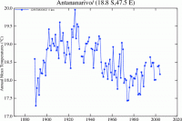
Icecap reality check: here is the NASA annual temperature plot since the 1880s for Antananarivo, a large city in Madagascar with a population of 452,000. See if you spot any signs of global warming. I always thought for there to be warming, temperatures actually had to rise. The creatures can’t read IPCC reports or model forecasts. Maybe they are moving because of the loss of habitat to population growth or trying to escape those crazy scientists with cameras and probes.

See larger graph here
|
|
|
|
